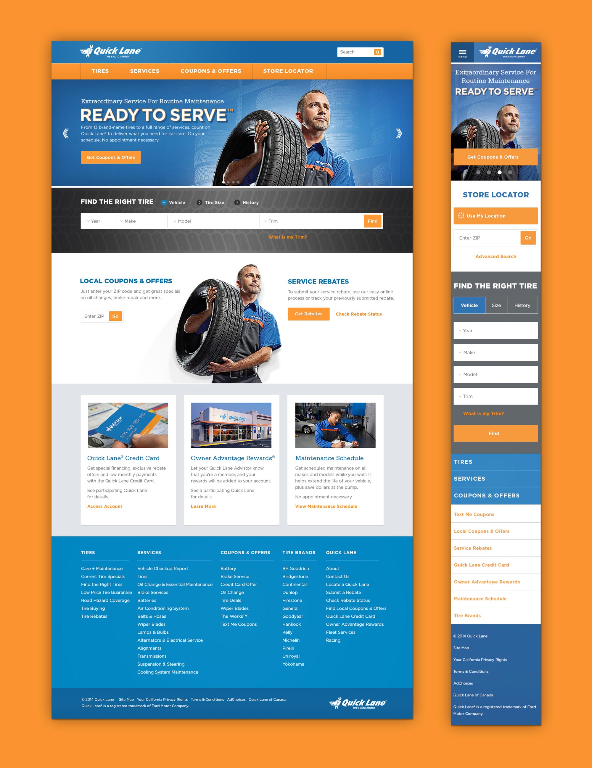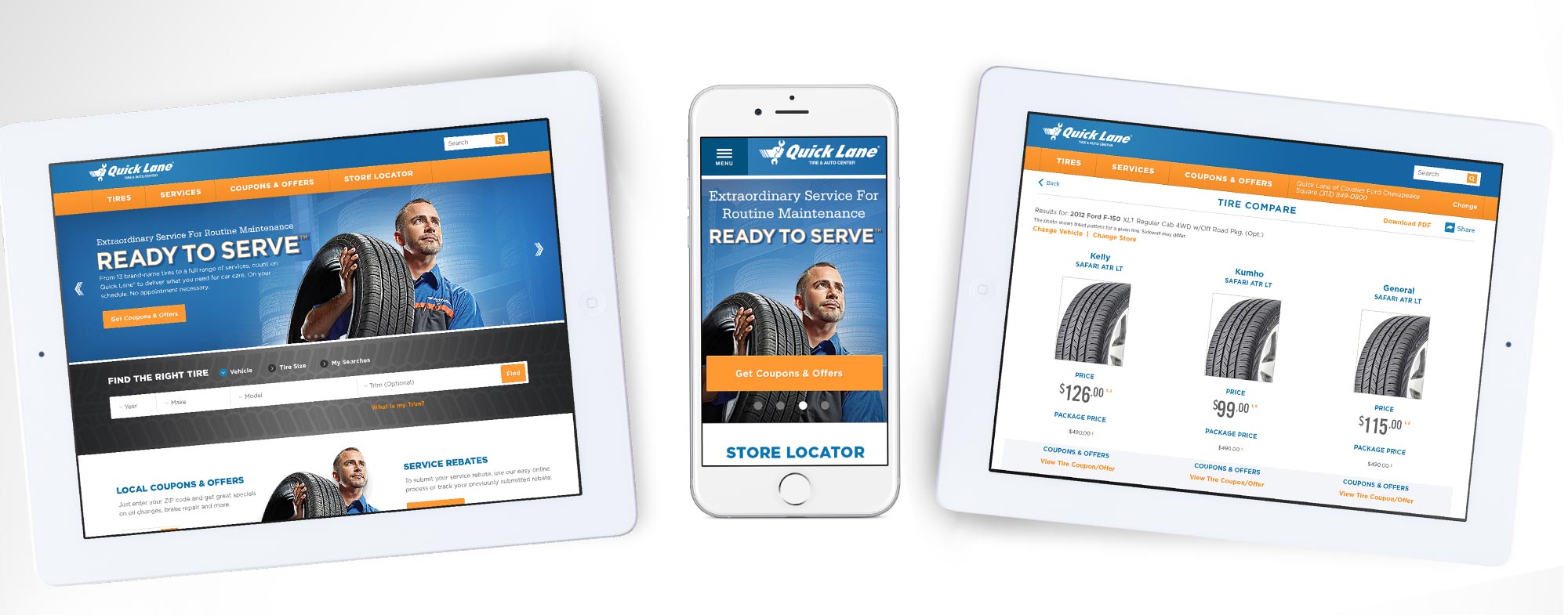
Quick Lane Site Redesign
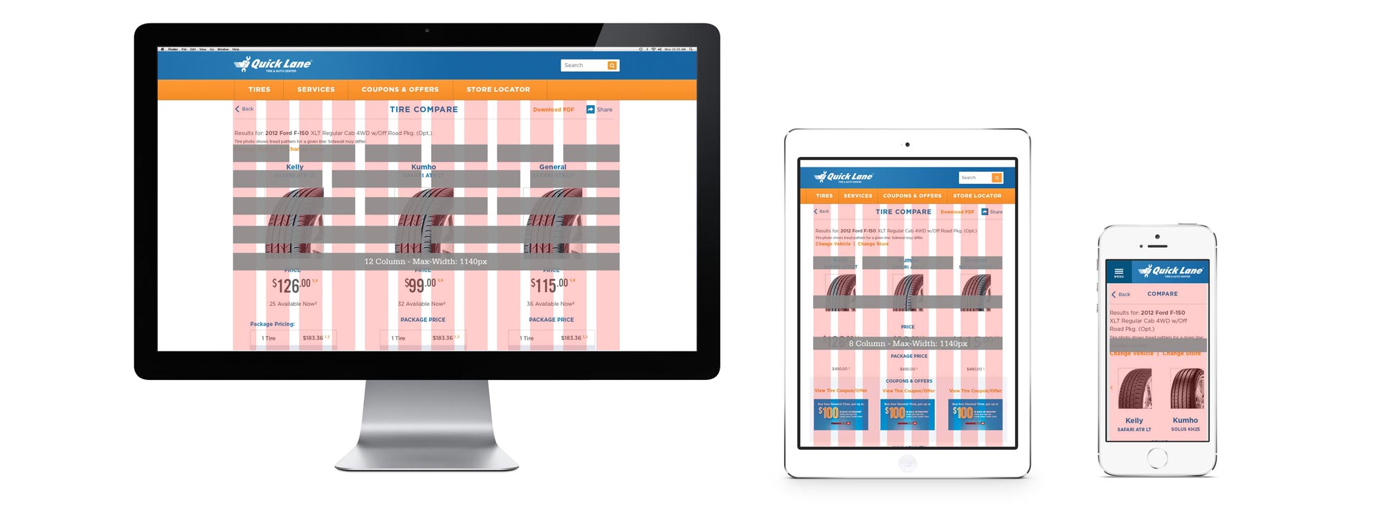
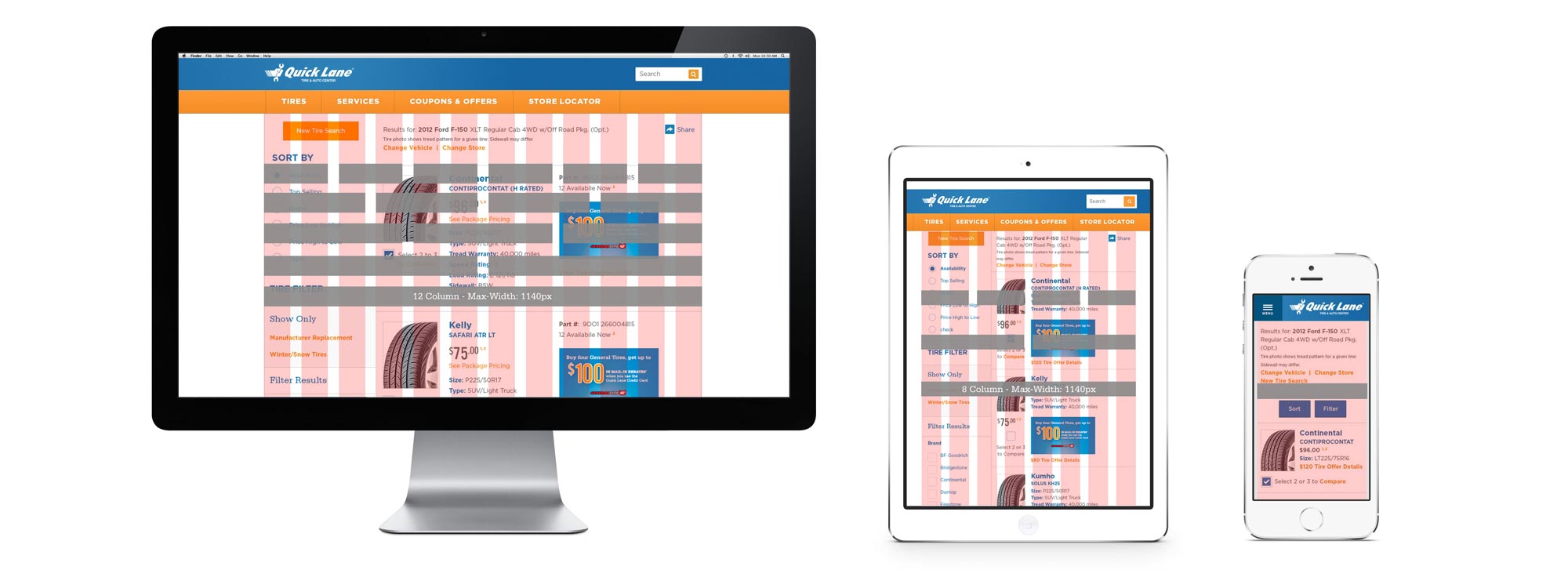
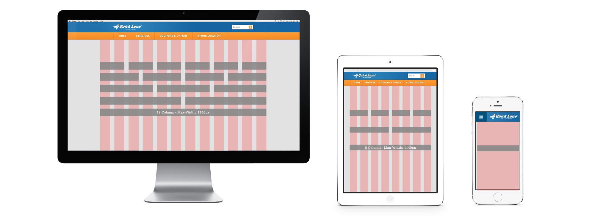
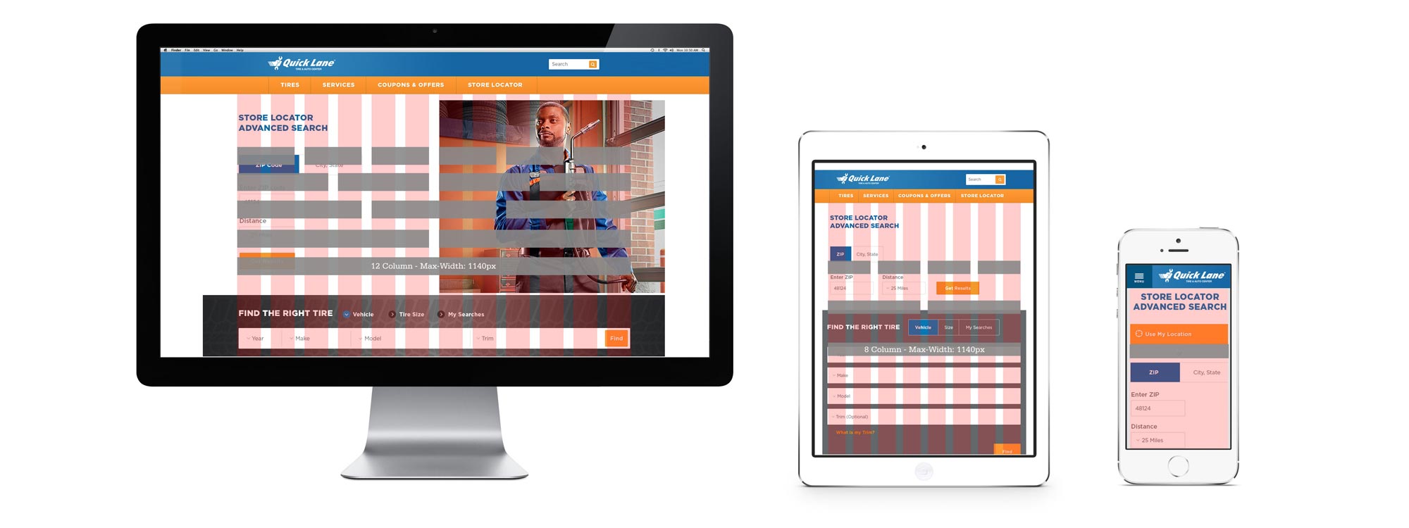
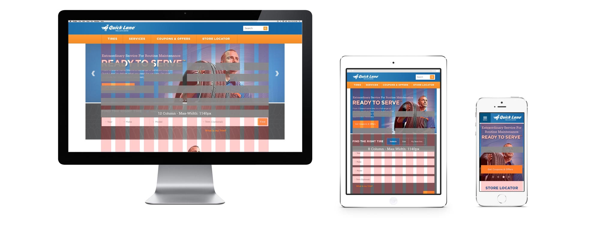
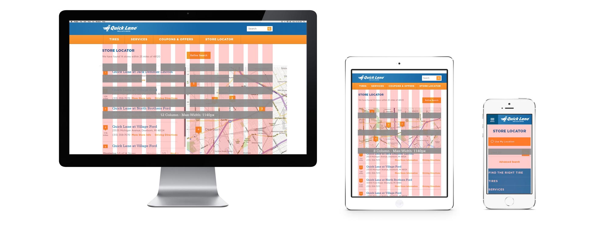
Objective to redesign Quicklane.com to a responsive design for engaging mobile experience. UI and layout designs were achieved as the collaborative partnership of a team, in which I’ve provided focus in several areas of the design process, like the setting a grid system to organize the UX with the site’s content on the page.
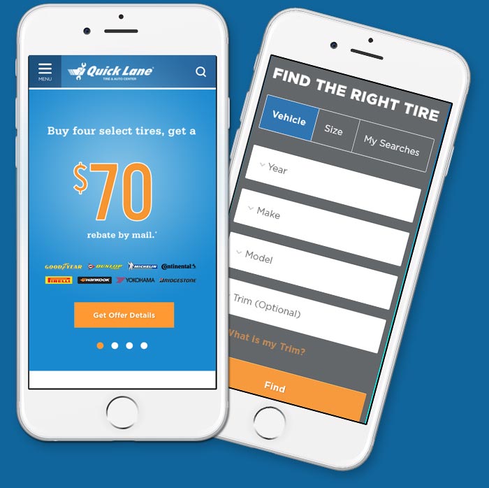
Search Deals Online
+ Find a Shop Near You
This site is loaded with internet coupons for auto services and products, and it helps you find the right deal for you. All the information you need to make a desicion is laid out here, and it helps you easily locate the nearest shop to you while you journey through the site.
This site is loaded with internet coupons for auto services and products, and it helps you find the right deal for you. All the information you need to make a desicion is laid out here, and it helps you easily locate the nearest shop to you while you journey through the site.

This site is designed to:
• search for special offers
• search for product
• search for service
• data charts
• discover self-help car maintenance
• store locator

Design Challenge
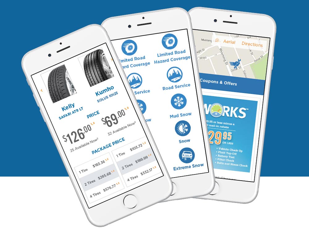
In order for the organization of site content to adapt to mobile, tablet and desktop, a functional grid system is designed to show how the content can flow across devises.
